
The Aging World in 3 Graphs
I was talking to some healthy and vital colleagues in their early 60s about retirement and “warned” them to be careful about how soon they retired because as health guideline followers, they would likely live many, many more years. For my friends the issue is not financial security, but the stimulating nature of their jobs, and their roles as mentors/teachers and super skilled physicians. From my perspective the “aging world” is one of a couple main drivers of the challenges facing us all including the political and financial issues related to budgets, debt, and health care costs. This is true both for the United States and the rest of the world as well. That having been said, I want to show you three graphs about the history of aging.
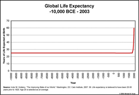
Nothing Changed Until the Industrial Revolution
The first graph is from a book “The Improving State of the World”. It shows that for most of human history life expectancy was pretty static and nothing really changed until the industrial revolution starting in the 1700s. The extent to which the industrial revolution and the invention of the steam engine “caused” life expectancy to rise is unclear. During that time frame “modern” ideas about sanitation, nutrition, improved agriculture, public health etc. started to emerge as well. So a lot was happening related to the development of the world we live in today.
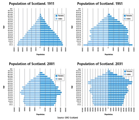
Population Pyramids and Scotland
The second graph is shows the population vs. age structure of Scotland. I chose Scotland because this figure is a typical example of what has happened in the developed, “rich” parts of the world over the last 100 plus years and this graph was especially well done. In 1911 there was a classic population pyramid with a lot of young people and very few older people. As infant mortality and other things that kill young people were conquered over the next 40 years, the base of the pyramid had really changed by 1951. By 2001 there were as many or more middle aged than young people. The wide “waist” of the pyramid associated with the baby boom will also swell the growth of people over 65 by 2031. This figure also shows that more women make it to old age than men. The implications of these shifting pyramids for things like the ratio of workers to retirees, health care costs and pension costs are immense. Here is a link to a Wiki site on the whole topic of population pyramids.
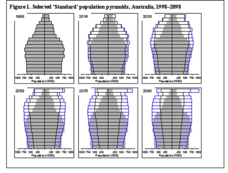
The Future & Population Pyramids
The final graph is from Australia and shows what is projected happen to the population pyramid there over the rest of the century. The projected data is superimposed over the 1998 data. Again, these trends are pretty typical for the developed world and similar trends are starting to emerge in places like China and other developing countries. They clearly demonstrate that the cultural, political, and financial discussions we are currently having about the aging population are going to continue. The massive rise in the top part of the pyramids (people older than 80 or even 90) is likely to be especially challenging.
Demographic Reality?
You can look at these graphs, especially the last two, all sorts of ways. However, it seems to me that as individuals, cultures, countries, and “the world” we need to have a serious conversation about what policies make sense given the coming demographic reality. For example, should the retirement age remain 65? What are reasonable expectations to place on young people for support of the “old” as the population structure changes? How should pensions and social insurance programs be structured? There are many nuances to these questions but the fundamental demographic issues are unlikely to change.

This entry was posted on Monday, May 6th, 2013 at 5:19 am and is filed under Current Events. You can follow any responses to this entry through the RSS 2.0 feed. You can leave a response, or trackback from your own site.
Leave a Reply
LIKE MIKE

SUBSCRIBE TO RSS
