
Did The Future Begin in 1980?
I thought it might be fun to do an end of 2013 post on the “future”. However, as I looked for interesting graphics about the current world and where we might be headed, it occurred to me that the future as we know it (and as it is likely to emerge) really started in about 1980. Here are some examples:
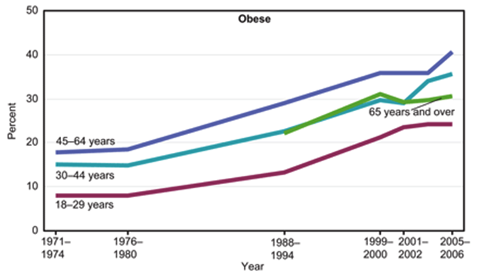
1. Obesity
The US in specific (and the world in general) is fatter than ever. This trend started in the US in about 1980 and other countries are now “catching up”.
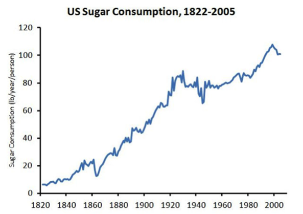
About the same time sugar consumption started to increase as well above levels that had been stable from about 1920-1980. This has largely been due to high fructose corn sweetners. Some argue that this increased sugar consumption is “the cause” of the obesity epidemic. The view I favor is that it is emblematic of rise in processed food and calorie consumption, more screen time, and less physical activity.
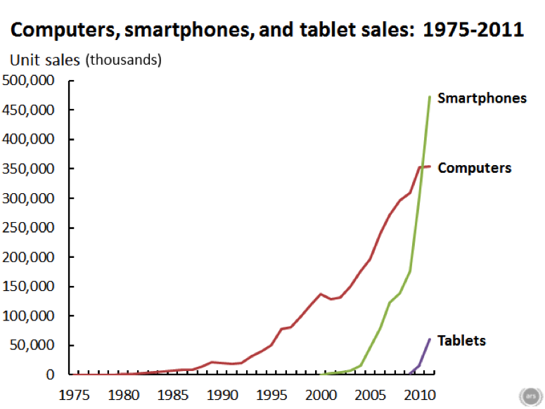
Speaking of screen time, below is a graph that shows the rise in consumer electronics over the last 30 plus years. Like obesity rates and sugar consumption, things started to change about 1980.
2. Smoking
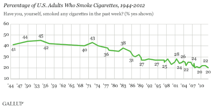
While obesity, too much processed food, and ever more screen time there are making us less healthy there is at least some good news – smoking rates are at an all-time low. There was some downward movement in the 70s, but things really started to drop in about 1980.
3. It’s the Economy Stupid
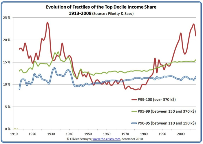
The big things you hear about related to the economy focus on things like income inequality, globalization and the loss of manufacturing jobs in the US. Again, none of this is new and if you look at the chart below you see that the fraction of total income (red line) going to people in the top 1% has doubled since about 1980.
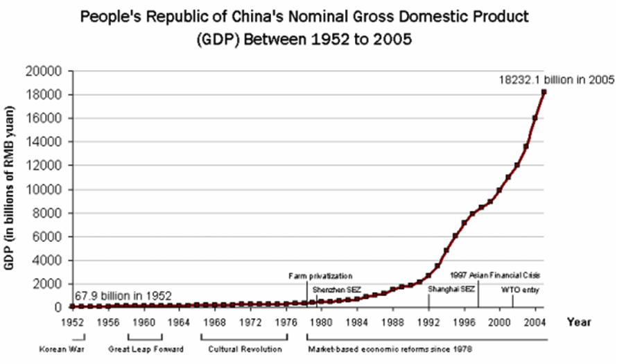
The next chart shows what has happened to China’s economy since 1980.
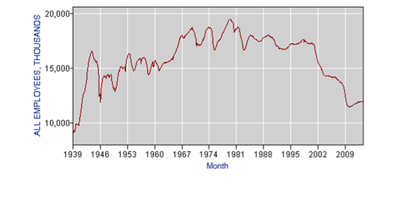
US manufacturing jobs trended upwards in the post WW2 era until about 1980 and have since declined pretty dramatically. The next chart shows the total number of manufacturing jobs in thousands.
For those who seek a single cause for the rise income inequality it would is easy to make a simple conclusion that income inequality was “caused” by either globalization or the loss of manufacturing jobs since 1980. However, like obesity, the cause has probably been multifactorial but it is hard to believe that globalization and loss of manufacturing jobs were not major contributors. It is also interesting to think about the effects of the electronic environment on jobs as machines and computers do more and more things.
4. The Future of The Future?
So perhaps the future is a fatter, screen time driven world with more economic disparity. Or maybe there is nothing new and that version of the future has been with us since about 1980? The one new trend that will have a both a national and world wide impact (at least as big as the seven charts above) is the aging of population. The final chart shows the ratio of people over 65 to the number of people between 15 and 65 in the US. Things start to take off in about 2010 as the baby boom generation starts to hit retirement age.
Look at the chart and ask yourself what will the world look like when there are more older than younger people? Will the pension and medical care costs caused by aging bankrupt whole countries? Is a rise in the retirement age unavoidable as a result of this new demographic reality? What constitutes “fair” for government spending and tax policies? The first seven charts are a look back and what they report was probably unanticipated by most people in 1980. The final chart shows a trend that will almost certainly happen and that we need to prepare for.

This entry was posted on Monday, December 30th, 2013 at 5:20 am and is filed under Current Events. You can follow any responses to this entry through the RSS 2.0 feed. You can leave a response, or trackback from your own site.
Leave a Reply
LIKE MIKE

SUBSCRIBE TO RSS
