
Archive for the ‘Health Policy’ Category
Fixing the health system: Four facts to focus on when reading election year health policy stories
click for link


An Open Letter to Vice President Biden
An Open Letter to Vice President Biden
RE: Cancer Moonshot Announced at State of the Unions Address
Dear Vice President Biden,
I am writing to give you some background information and perspective on the new moonshot cancer initiative designed as President Obama said to “…make America the country that cures cancer once and for all.” Here are a few thoughts:
First 70-90% of cancers have major environmental and behavioral causes and are not simply genetic or biological destiny. However, only about 6% of the NCI budget is spent on prevention. If you want to cure cancer the best way is to prevent it from happening. This has been known for a long time and the big success in cancer over the last 30 years has been tobacco control. However, there are many policy barriers to executing comprehensive cancer prevention efforts. Use your political skills to take these on.
Second, the fancy new targeted drugs that were going to strike cancer at its molecular core are not nearly as successful as envisioned. In fact they may not make much difference at all for many types of cancer. The other problem is that these drugs are expensive and don’t work very well; they are in fact toxic. When they do work, they extend life for a few months.
Third, the old idea from the 1990s and 2000s that with genomics we could understand the genetic causes of cancer has been largely disappointing. There are multiple mutations in most cancer cells, and biopsies from the same tumor in the same patient tell different molecular stories. Some people think this is going to make targeted therapy really hard if not impossible. It certainly is a cautionary tale and shows that just when people think they have cancer figured out, they don’t. It is also going to make early detection much harder than people like Jeff Bezos and Bill Gates think. When it comes to the techies and omics people channel Ronald Reagan and “trust but verify”.
Fourth, there are all sorts of issues with the experimental models to study cancer, the way basic cancer research is conducted, the clinical trial system in the U.S., and what the statistics tell us about success or lack of it. These academic and policy issues have been covered in detail by journalists like Clifton Leaf who is also a cancer survivor. They have also been known about in the academic world for a long time. You and your staff should study the history of the War on Cancer and see what “after action” lessons might be learned. A little humility might be in order here as well. In 2005 the head of the NCI boldly predicted that as a result of what has come to be branded as “Precision Medicine”, death and suffering from cancer could be eliminated by 2015. Since that time the statistics have barely budged.
In closing, there are many other facts and caveats I could add to this letter, but you are busy. However, to simply spend more resources on the same sorts of efforts that have produced such marginal gains over the last 40-50 years would simply be an exercise in fighting policy trench warfare with more trench warfare. It would also be a waste of your grief, political skills and well-deserved prestige, and the new resources. Most importantly, it would be a disservice to patients.
Sincerely, Michael J. Joyner, M.D.
P.S. in the unlikely event you or members of your staff would like to discuss the ideas outlined in this letter it would be my pleasure.
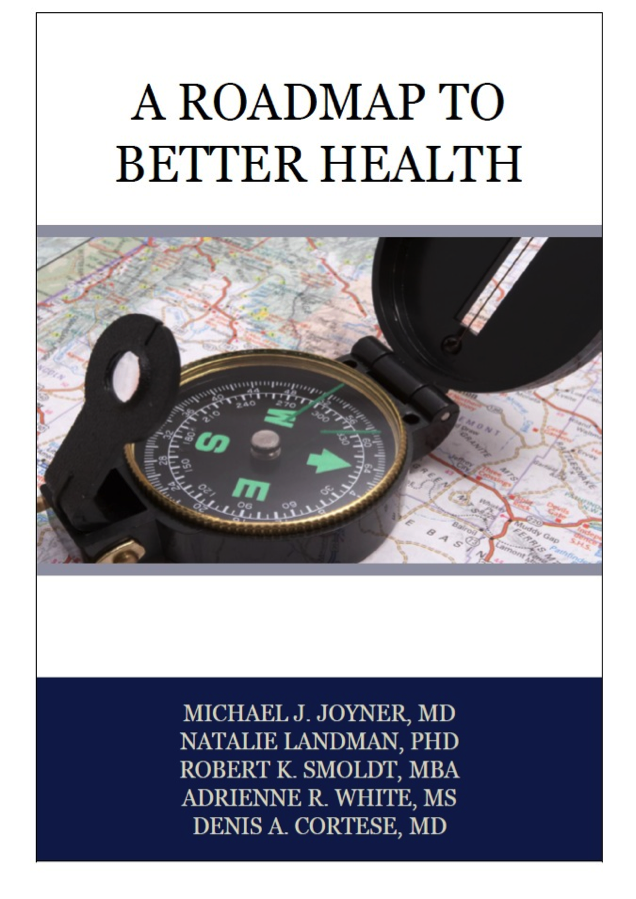
A Roadmap To Better Health
It is finally here! Our data packed and evidence based book on major issues affecting the health of the U.S. population, including smoking, diet, physical activity, and the policy options to move us in the right direction is now available. You can download a no cost PDF version of this book (and other books from the Roadmap series) from the website of the Arizona State University’s Healthcare Delivery and Policy Program. A paperback version is also available from Amazon (no profits to us). We hope that this book will be useful to a wide range of people interested in the topics of population health, physical activity, exercise and diet. We have focused on basic data related to these topics and what policies might be used to promote healthier lifestyles for both individuals and society as a whole.
What Happens if Life Expectancy Keeps Rising?
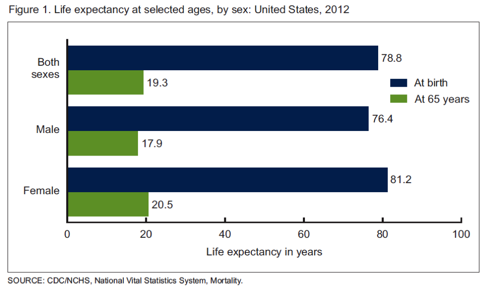
The US Centers for Disease Control (CDC) recently released its annual report on life expectancy. The data covers 2012 and show life expectancy continuing to rise in the US. The chart below is the current data and the overall average is a little over a month higher than the estimate for 2011. Additionally, there were gains in most ethnic subgroups. The green bars in the chart also show that the average person who makes it to 65 will likely live another 19 plus years. That number is also trending upwards.
US Life Expectancy Still “Low”
Life expectancy is still relatively low in the US compared to other rich countries with numbers in the low 80s. The reasons for this are complex and center on issues primarily related to economics, behavior, and to a lesser extent access to medical care. The chart below is from an excellent 2007 report from the Social Security Administration, it shows that for men life expectancy at age 65 is going up faster for those in the top half of income compared to the bottom.
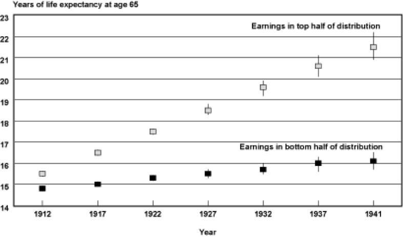
For example for men born in 1912 both groups could expect to live about 15 more years. For those born in 1941 those in the lower half could only expect 16 years of additional life compared to their better off counterparts could expect about 21 years of additional life.
How High Can Life Expectancy Go?
In previous posts I have tried to dissect out how much of some of these life expectancy gaps are due to things like differences in health behaviors and or economics. If life expectancy for people who are less well off “catches up” with the numbers for the better off it could have major implications for the overall number. There was also a great longer article in the Atlantic about the implications of a population wide life expectancy of 100. The article also highlighted a debate in the epidemiology community. Some people see life expectancy continuing to rise while others see it flattening out somewhere in the 80s. There is also some speculation that it might decline due to the obesity epidemic and a rise in diseases like diabetes. The next chart is from a classic 1990 paper and shows what happens to life expectancy at age 50 for both men and women if cancer, cardiovascular disease and diabetes are eliminated. Life expectancy rises but tops out at 90 for men and 96 for women.
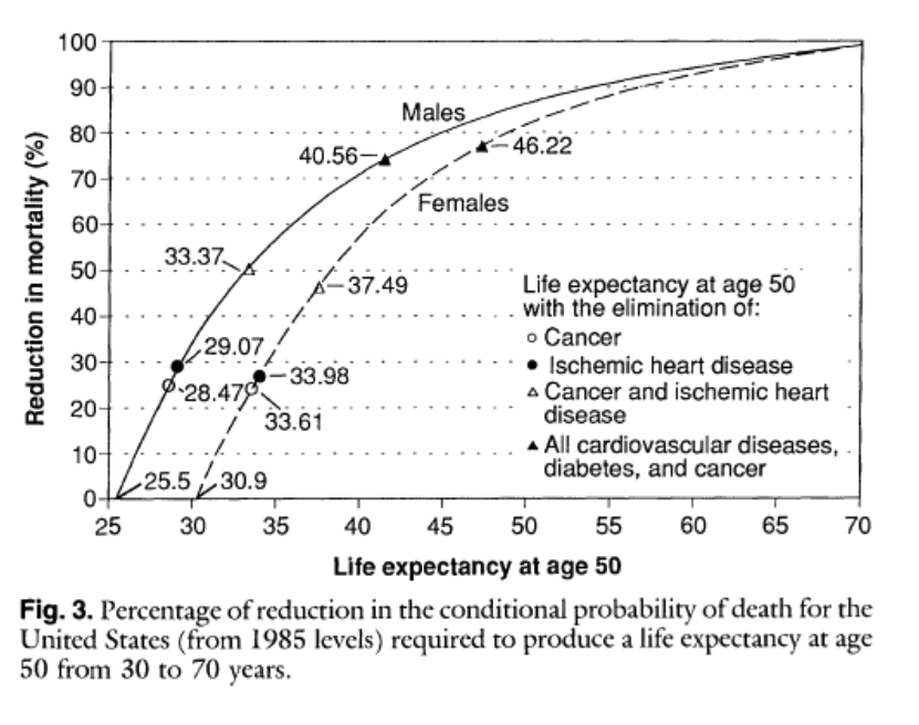
This type of analysis argues that while life expectancy might continue to rise, it is not going to get 100 anytime soon without the development of some sort of magic bullet anti-aging therapy. It is also interesting to note that populations of “guideline followers” who don’t smoke, exercise, don’t get fat etc. frequently live to about 90.
Structure of Society
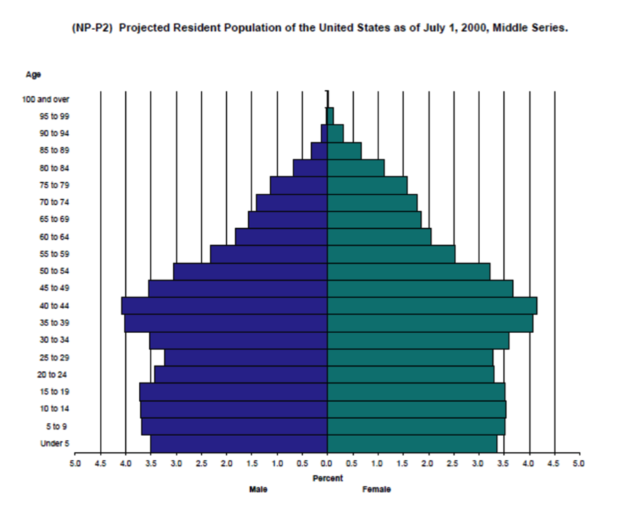
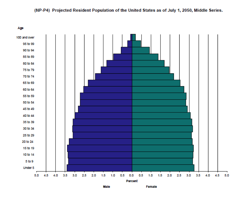
The next two charts are “population pyramids” for the US. The first is for 2000 and the second is an estimate for 2050. As life expectancy increases and the average woman has fewer children the population will age.
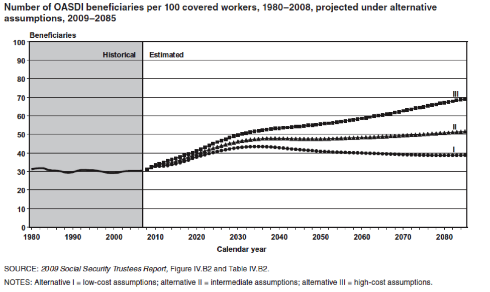
The key point is that there are going to be a whole lot more old people that there used to be and the next chart shows the implications for this in terms of the number of workers to retirees. Today there are about 35 people receiving Social Security benefits for every 100 workers. In 2050 that number will be about 50 per 100 or perhaps as high as about 55 per hundred. Some version of these ratios will ultimately affect all programs directed at our aging population.
Something Has Got To Give
As a result of the aging population, the long term implications of programs like Social Security and Medicare on the US Federal Budget have been well known for many years. There has been some recent good news on the economic front in terms of the relative robustness of the US economic recovery compared to historical trends for recoveries after financial meltdowns. Additionally, health care spending has moderated and there is some positive news on the federal debt. All of this has provided the President and Congress with a window of opportunity to address some of the fundamental issues associated with an aging population. However, for Social Security and Medicare none of the choices will be “fun” for political decision makers because solutions include things like:
- Raising the retirement age
- Cutting or restructuring benefits
- Raising taxes
Given the gridlock in Washington, my personal bet is that nothing will happen until the later 2020s when the problem of how to finance social programs for an aging population becomes more acute as a result of increasing Federal debt and concerns about the solvency of the trust funds linked to the programs. Coming up with long terms solutions sooner rather than later would surely be less painful in the long run. However, I don’t expect any sudden outbreaks of either the political courage or the negotiating skills needed to address the fiscal challenges of an aging population until there is a crisis.
The Obesity Tax vs. Sin Taxes & Big Soda
There is lots of interesting news on the obesity front and I thought it might be fun to highlight a couple issues and raise a few questions.
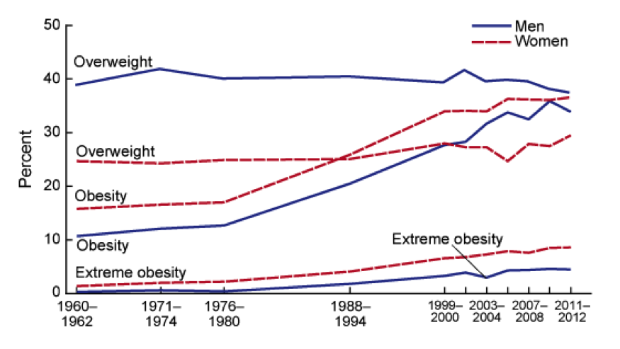
How Fat Are We?
The chart below shows the trends in obesity or overweight in the US over the last 50 years. Things might be leveling off a bit, but the question really is how much worse can it get. In fact some epidemiologists are asking if eventually all Americans will be obese or overweight. For those of you not familiar with the definitions of obesity and overweight you can find them here.
How Much Does Obesity Cost?
The estimates are all over the place, but according to Forbes it is on the order of 450 billion per year or a little less than 3% of GDP (16.8 Trillion) or about 70% of what we spend on national defense. Some of this is medical costs, but some of it is productivity, fuel costs, food costs, you name it. It is also a lot of money any way you look at it and I believe that the $450 billion estimate is only for obesity and not for overweight. Of course things scale as both individuals and society as a whole moves up the scale, so the combined costs of overweight and obesity are likely significantly higher than those for obesity alone.
What About Big Soda?
The other related news is that there are soda tax questions on the ballot this fall in San Francisco and Oakland, and given the 0 for 30 plus track record of similar ballot questions, some are calling this the “last stand” for soda taxes. As you might imagine this initiative is facing major opposition from so-called big soda, a phrase used by activists to conjure up images of big tobacco and big oil. At the same time “big soda” is promising to voluntarily reduce calorie consumption from their products by 20% by the year 2025. Skeptics have called this a move to avoid or delay regulation right out of the safer cigarette playbook.
Who Pays?
While there is way more to obesity that sugar and sugary drinks, it seems to me that all of us are paying essentially a hidden obesity/overweight “tax”. Thus it might make more sense for those who use products linked to obesity to actually pay a real tax for their behavior. This could raise revenue to cover some of the costs of the problem and might also lead to behavior changes to reduce the magnitude of the problem. Comprehensive tobacco control took decades to happen. Given the costs and health consequences of obesity, how long will a comprehensive program for calorie control take to emerge? It is almost certainly coming one way or the other.
The Politics of Life Expectancy & Lifestyle
Eventually the official retirement age for things like Social Security and Medicare is going to have to rise. The simple reason is that the ratio of workers to “retired people” will drop low enough (about 2 to 1 in the U.S. by the middle 2030s) that the programs will be unsustainable both financially and politically as younger generations balk at paying the bill for a wave of older baby boomers.
A related topic is that increasing the retirement age is fundamentally unfair to baby boomers who are less well educated and less well off. The idea is that the big increases in life expectancy projected for the boomers will go mostly to people who are better off and stagnate for the less well off. Also the US is not alone and the problem of keeping “state sponsored pensions” solvent is occurring all over the developed world. There is no easy way out of this and none of the solutions like reducing benefits, raising the retirement age or raising taxes are exactly politically attractive.
Life Expectancy Differences: Who is Responsible?
The effects of socioeconomic status on life expectancy are also complex, but at least some of it has to do with straight forward behaviors like not smoking. Incredibly, the poor who can least afford to smoke, continue to smoke at high rates while smoking among the well off and well educated has fallen dramatically:
“Total cigarette smoking prevalence varies dramatically between counties, even within states, ranging from 9.9% to 41.5% for males and from 5.8% to 40.8% for females in 2012. Counties in the South, particularly in Kentucky, Tennessee, and West Virginia, as well as those with large Native American populations, have the highest rates of total cigarette smoking, while counties in Utah and other Western states have the lowest. Overall, total cigarette smoking prevalence declined between 1996 and 2012 with a median decline across counties of 0.9% per year for males and 0.6% per year for females, and rates of decline for males and females in some counties exceeded 3% per year. Statistically significant declines were concentrated in a relatively small number of counties, however, and more counties saw statistically significant declines in male cigarette smoking prevalence (39.8% of counties) than in female cigarette smoking prevalence (16.2%). Rates of decline varied by income level: counties in the top quintile in terms of income experienced noticeably faster declines than those in the bottom quintile.”
You can basically modify this paragraph for almost any relevant health behavior and come up with similar conclusions about who is “doing better” where; or what socioeconomic subgroup is following health guidelines about body weight, diet and exercise as well as smoking.
Sooner or Later
It is just a matter of time until Social Security and Medicare along with similar social insurance and state sponsored pension schemes in other countries will bump up against a demographic wall. So, in the discussion about the changes needed to keep these programs viable, at what point does personal responsibility factor into the policy discussion and political debate? This is especially important because almost all key health behaviors are independent of access to medical care.
Wellness & Health Insurance
Several posts ago I wrote about the idea that people with certain controllable risk factors might be charged higher health insurance premiums. This issue has come to a head at Penn State University where a comprehensive wellness program, with financial incentives/penalties is being implemented. The obvious motivation for such programs is to reduce the cost of health care borne by large employers. A couple of things stand out related to the news reports on this topic:
Who Runs It?
From what I can tell Penn State is using a third party contractor to administer the program. In addition to focusing on the obvious stuff like smoking, diabetes, blood pressure, obesity, and physical activity; the third party contractor seems to be taking a deep dive into all sorts of behaviors that might or might not be linked to health and health care spending. Why? My guess is that over time the vendor can match answers to their surveys with health insurance claims data and use this data for all sorts of purposes. These might include things like even more granular rate structures or perhaps helping companies determine who to hire or not hire based on projected future health care costs. Like all big data some of it is about efficiency, but how easy and tempting will it be to hijack this information for other purposes? How do we ensure that such data really is being used to make people healthier vs. mostly making the bottom line healthier? Recent revelations in many areas of life make it pretty clear that privacy guarantees should be viewed with skepticism.
Focus on Fundamentals
If you take a big picture look at behavior and health data only a few things stand out. Don’t smoke, be active, watch your weight, eat a bit better and avoid excessive drinking. Also if your lipids, blood pressure or blood glucose is out of whack get it treated. I am all for ideas about controlling stress and health. However, there is pretty good evidence that people who are able to follow basic health guidelines are protected from many of the stresses of life . The fact that so-called third party wellness programs apparently want so much information has me scratching may head and tends to reinforce the idea that they want the data for other reasons.
Other Options?
Penn State is located in a relatively isolated area of central Pennsylvania and it seems to me that there are other less invasive options to improve the health of the university community. Is the community biking and walking friendly? Are highly effective smoking restrictions in place? My guess is the University serves a lot of meals every day, have the choices in the cafeterias and eateries been cleaned up? Is there a community wide public health approach to issues like exercise, blood pressure, cholesterol and diabetes? Why not partner with the local health care providers and go after these big ticket items? There are experts in all aspects of nutrition, exercise, public and behavioral health on the faculty of the University. Have these experts been engaged to design and evaluate a comprehensive program and share the results with others so we all learn? Why outsource this to a third party vendor who can monetize it?
My Take
I think it is a good idea to charge different health insurance rates based on a few simple things that people have control over. I would start with smoking, obesity, lipids, blood pressure and diabetes. Physical activity and physical fitness are harder to assess (there is no blood test), but they should be included as well. However, I think charging different insurance rates for controllable health risks needs to be part of a comprehensive approach that makes it easier for people to change their behavior. Using third party vendors and letting them capture the data, crunch the numbers, repurpose it and monetize it is not the way to go. We all own the problem of public health and high health care costs and we need to develop inclusive local and regional solutions. An “Us vs. Them” approach needs to be avoided
You are currently browsing the archives for the Health Policy category.
LIKE MIKE

SUBSCRIBE TO RSS
